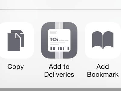
Add to Deliveries
So this is a tricky one. I'm working on an Action extension, and those have very simple, grey on white icons. Check out the attachment to see a bit more context. As you can see the built-in "Action" icons have a very simple dark grey glyph on a white background. Plenty of white space around them.
By default when you create an Action extension, iOS will take your app icon, invert it, and make it greyscale. If you're using the popular white-glyph-on-a-color-gradient icon style, this should look decent. If you have a different type of icon… not so much.
I spent a good while simplifying the icon, and I like how this came out. But I'm not sure it fits in as well as it should.
The second attachment shows an alternative, basically making the whole thing smaller. I tried going as small as the "Add to Home Screen" icon but it just looked wrong to me.
Any opinions?


