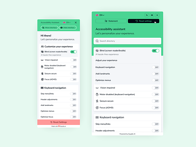
Equally Widget - Before / After
Before and after, widget underwent some additions and changes. From a visual perspective some customers were saying it felt too friendly/child like.
Without re-working the entire thing a few small tweaks like dropping the font weight on some headings, dropping the line thickness on icons and reducing the border size on buttons gave it a more professional vibe.
Need help with your project? Get in touch 📮 hello@robsimpson.digital
More by Rob Simpson View profile
Like
