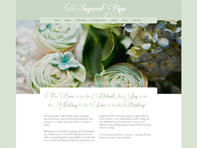
Sugared Rose Homepage
The client came to be with a brand she'd started to create that include the light green and two typefaces Prestige Elite and Some Weatz.
I introduced Cardo as a bridge between the two polar opposite fonts and suggested Some Weatz was only used as an accent, rather than for full headings and sentences.
More by Katherine Cory View profile
Like

