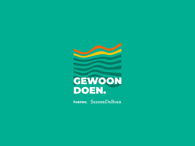
Gewoon Doen branding: Logo
Last year I teamed up with the Rotterdam offices of Hieroo and SeederDeBoer to design a brand for the ‘Gewoon Doen.’-campaign. The campaign is an initiative to inspire and energize (potential) clients and together we worked on a versatile and recognizable sub-brand.
Being a sub-brand for two companies with existing visual identities, we focussed on creating a brand that would compliment both styles. We paired Hieroo’s bright yellow and SeederDeBoer’s vivid orange with a deep green – the color that represents the city of Rotterdam in its flag. The waves of the icon are another visual representation of Rotterdam: the city is known for its harbour, the Maas river and its iconic bridges.
More by Jantine Zandbergen View profile
Like
