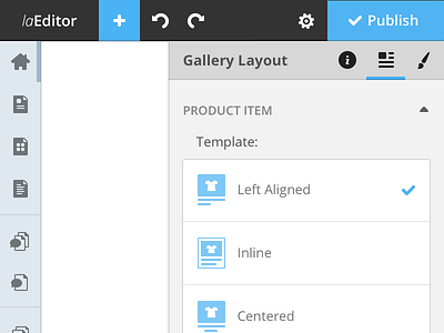
Website Editor
(^ Squeezed design, checkout full version)
A redesign concept I've made some time ago as part of an interview "homework" for somecompany (you could probably guess).
I wanted the editor to have a panel-based interface, Keynote/Pages-style, since the current one had nasty overlapping of floating panels.
Left sidebar is for navigating between the website's pages and components, hovering over it reveals its labels.
Checkout the attached screens and feel free to write some words, thanks.
More by Oz Pinhas View profile
Like


