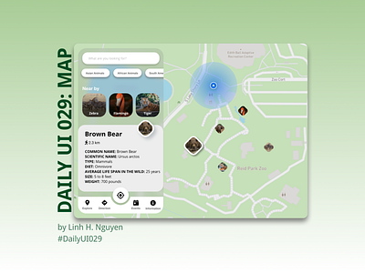
Daily UI 029: Map
#029 Map
Hint: Design a map. Not one of those old school paper ones though. Ok, that might actually be kinda neat too. ;) What type of features should it have? Should its color scheme compliment the brand the map is designed for?
I tool me a lot of time to come to this idea. Finally, I chose a zoo's map app to go with. However, I still stuck with color scheme idea for this map so I only went with very basic black and white color. Of course, there are points and aspects that can be improve to be more usable and user friendly, I'm always open for suggestions and feedback.
Feels good to be back with The Daily UI challenge.
More by Linh H. Nguyen View profile
Like
