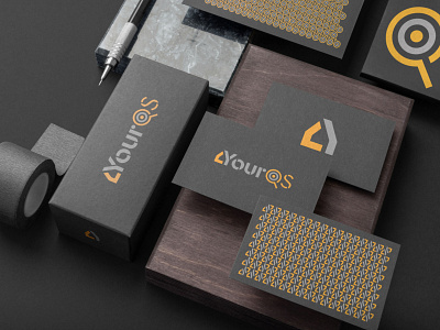
YourQS - Quantity Surveyors
A robust and considered brand project that is reflective of the quality of the Quantity Surveying service it represents. YourQS is geared towards the budget-retail market, using a unique process-driven approach to reduce extraneous expense. Potting Shed began from the ground up with nomenclature, moving swiftly on to brand design and visual language for social media.
The brand is bold, contemporary, and legible. The stencil style type was chosen to emphasise the idea of a whole made up of multiple component parts. The outside edge of the letter Y helps to form an icon that shows the gable-end of a house that can be seen as flat or three dimensional. Furthermore, there is a secondary symbol formed within the Q which references both a magnifying glass (and the associated references to close scrutiny and a detail-focused approach), as well as a target within (and the associated reference to goal orientation).
These three simple concepts immediately connect the viewer to the service offering in a legible and concise way. The high-contrast orange (a subtle nod to the owner’s nationality, referencing the Irish flag) keeps the brand fresh and vibrant whilst still appropriate to the construction industry.
Using clean and crisp geometry, the StyleScape was developed to inspire a themed look that sits in the desired budget-retail bracket, while alluding to the complex mathematics and intelligent measurements behind the service.
Approachable yet professional, the StyleScape ensured great scope for developing a wide variety of visual solutions across a range of media while maintaining modest costs.
Putting this style into practice for the Social Media Toolkit led to a distinct suite that helped categorise content themes with both flexible and cohesive solutions.


