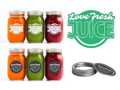
Love Fresh Juice Logo Revamp + Packaging
This is the logo revamp for Love Fresh Juice. They insisted on keeping the "backwards F" from their original logo and wanted something "clean and simple" to reflect the nature of their products.
It was an obvious choice to utilize the bold colors of their delicious juices in the packaging so an all-white on clear a substrate was the way to go!
More by Quinn Erickson View profile
Like
