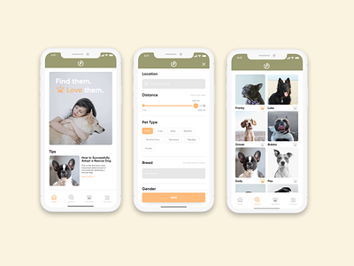
Petdar Redesign Concept
As an avid animal lover and previous user of online animal adoption platforms, I wanted to attempt a redesign concept for Petdar, an online app dedicated to animal adoption services. Despite the dark user interface not reflective of a pet adoption experience, the app has a decent number of users. However, while searching for a pet, I found a few pain points along the way. I felt that the main navigation was misleading. I needed to use a second navigation menu separate from the primary one to refine my search. So, this made me curious and wonder, "Would other potential pet parents have similar pain points navigating this app?" My goal was to understand how I could create a better navigable UX, make it look more reliable, and give it a fresh look reflective of a pet adoption experience. Let me know your thoughts!

