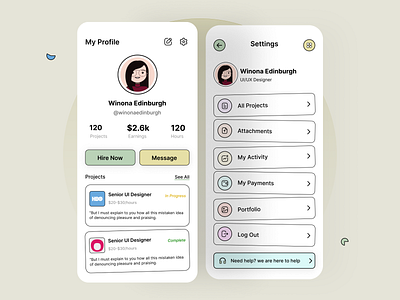
Profile Screen
Hey Dribblers,
I am back with another concept design for the user profile section on a mobile app.
If you are betting a lot on user experience (and you should), make your profile screens intuitive, clean, and functional, especially if user profiles have to be visited often.
What do you think? Please drop your thoughts on comment section.
I hope you like it!
Tool Used: Figma
Thanks for viewing!!!
More by Ankit Kumar View profile
Like
