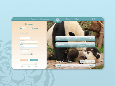
Credit Card Checkout page for a Zoo
Hey guys, Maarten here!
Here's my take on Daily UI 002. I designed a Checkout Page Concept for a Zoo. I tried to keep the interface as simple and clear for the client to go through the process. The overall theme is warm and friendly, which is accentuated by the rounded shapes. I gave the whole some pop by adding a 3D feel to some elements. Stock image is from Pexels.com and logo from Freepik.com.
What do you guys think? I'd love to hear your feedback! :)
Greetz
Maarten
More by Maarten Beyens View profile
Like
