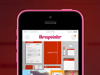
Threepointer for iOS - case study
I thought it would be cool to see what Threepointer (unofficial Dribbble app for Windows Phone) might look like on an iPhone. So I made a little case study for iOS with 3 different styles.
This is the first (pretty traditional) design with adopted colors and layout from the Windows Phone version, except that scrolling Threepointer now works vertically and not horizontally.
You also get the regular tab bar with custom icons.
I'll post the second and third version in a bit :)
More by Stan Gursky View profile
Like

