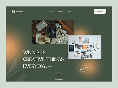
Studio Website Header
Hey, what's up my friends🙋♂️
I am excited to share the home page header exploration I've been working on, have a look at this online Studio platform. Here we tried to show how the less is more rule works. Nice and clean, nothing excessive. Do you like it as much as we do?
I am available for UI/UX projects! Remote | Project Base | Full-time Work
Work Inquiries🔥: uixasif@gmail.com
More by Asif Howlader View profile
Services by Asif Howlader
Like
