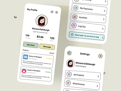
Profile Screen
Hey Dribblers,
We are back with another concept design for the user profile section on a mobile app. If you are betting a lot on user experience (and you should), make your profile screens intuitive, clean, and functional, especially if user profiles have to be visited often.
What do you think? Thanks for viewing. We hope you like it!
Tool Used: Figma
Our UI/UX team is available to take on new projects immediately.
Tell us about your project at contact@resourcifi.com.
More by Resourcifi View profile
Like

