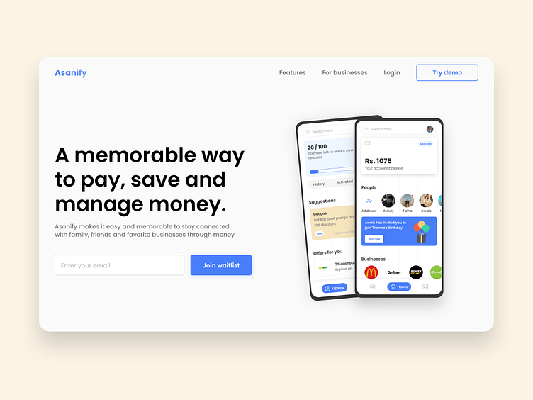
Asanify Landing Page - Reimaging Banking Experience
Good day, everyone!
With Pakistan's fintech industry on the rise, as well as the expanding concept of rewards and cashback apps like Savyour, Vouch365, and others, I thought to myself, "What if we develop an app that lets individuals spend, manage, and save all in one place?" Why do all of these tasks require the use of multiple applications?
Keeping that in mind, I began understanding the traditional method - people I hangout with - use and performed a few phone interviews to see whether or not there was an problem. After a week of exploring fintech and rewards applications, discovery and interviews - I found out that this is a real problem and decided to come up with a solution.
And, here is what I came up with...
Asanify - A memorable way to pay, manage and save money all-in-one place.
I will be sharing a few more screens in my next Dribbble shot and here is just a simple hero section I designed. If you want to know my entire design process from discovery to solution, you can check out the case study shared below.
Here's the link: https://www.behance.net/gallery/128214705/Asanify-Reimaging-Banking-Experience
________
Design - Adobe XD
Icons - feathericons.com
Images / Illustrations - Google, Unsplash.com & Undraw.co
________
Loved my work? Feel free to email me at pahmed980@gmail.com or just hit me up here on Dribbble.
Or do you simply want to talk user experience, product design, and technology in general? I am always available on LinkedIn and Instagram; let's connect, I will be happy to chat with you.
