Shopping list UI exploration
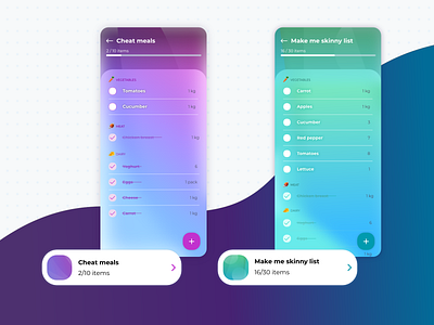
In my speed design challange I focused on shopping list. My main focus was to make them as easy to manage as possible so I divided the products into sections and created two contrasting states of the product on the list. To add a bit more fun, each shopping list has different main color that changes the UI color scheme on the view.
Thanks to my team for the challange and many interesting discussions around shopping habits :*
More by etteplan design team View profile
Like

