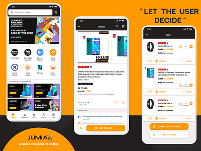
Jumia App Checkout Re-design !
Here is my redesign of the Jumia app's checkout process. this was born out of a particular issue with lots of users which I noticed and researched on.
Problem: Many users of the Jumia app are fond of adding items to the cart mostly to check out later or just to save them for easy locating, despite the fact that Jumia has a saved items button, many users simply find it convenient to add items to the cart for later, but the snag is you have to check out every item in your cart, leading to users deleting those items.
Define: Having asked different users and conducted a short research on user attitude towards the chechout process, sampled options of different users all pointing to this same issue, i defined the problem to a lack of user control over the checkout process and the extensive search filtering process which made users unwilling to search for items after been removed from cart, leading to the initial subject matter of them wanting to save as many items in the cart.
Idea: The idea was to re-design the checkout process of the jumia app focusing on control at all points of the process, including selecting which items to checkout while leaving the others in the cart, ability to remove an item at all points in the process thereby allowing users keep items as long as possible (even when sold out ).
Prototype: The re-design was conducted on few screens, with few visual changes bringing much more ease to visibilty while adding a tone of minimalism but still borrowing from existing elements .
Test: So far feedback from prototype testers has been possitive with constructive criticism taken and recorded for a better iteration
Prototype Link
https://www.figma.com/proto/0UnCTiUAHJswMtkfNEw3Qg/Jumia-Redesign?node-id=0%3A1
