Logo inspired by the collapsed bridge.
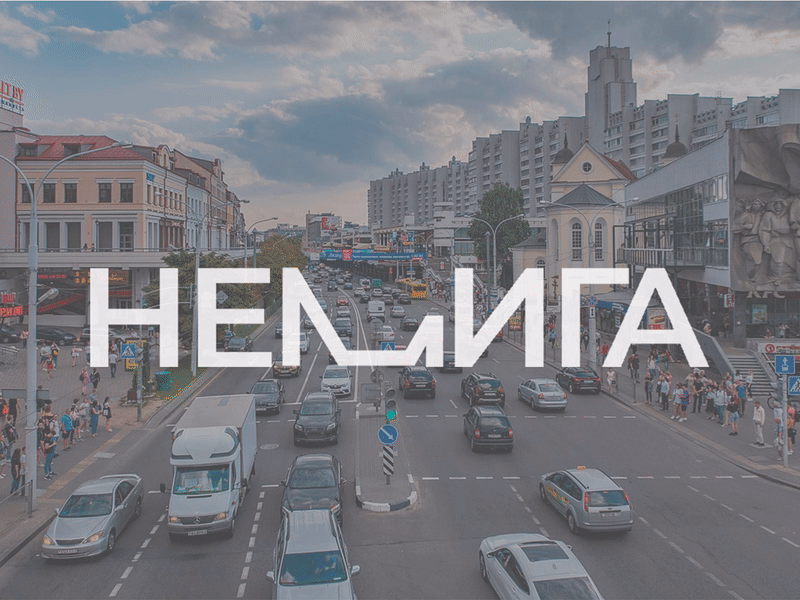
The topic of territorial branding has long been Belarus. And also the bridge is recently destroyed and … gives a reason to remind about this topic a little. And so the visual concept of the logo, the corporate identity of the Nemiga area, inspired by the news of the collapsed bridge. The construction of the bridge fell in such a way that it did 99% of the work for me - this is the molded part of the letter M. And this letter does not differ in Cyrillic and Latin, which means that it makes our life even easier, creating a tourist brand of Minsk on its basis. If there is a Leaning Tower of Pisa, then why cannot there be a collapsed Nemigovsky Bridge, as a symbol of the total devastation of our time?
