Logo Concept 10

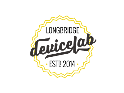
A simpler design, with much more subtle nods to retro car badges. I really like the strong, simple colour scheme on this one. Type is set in Voltage and Oswald. The client pointed out that we should shift focus from ‘Longbridge’ to ‘Device Lab’. It’s a bit ‘hip’, but that suits the identity we’re going for.
