Payment iOS Design
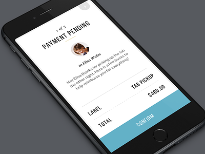
Here is a quick look at two iOS screens from a unused direction. Screens show standard payment review screen and module that pops down to edit items. User clicks on the green check to save and go back to their payment screen.
Full pixels attached.
Thanks to @Creativedash for the sweet iPhone 6 mockup.
More by Termini Design View profile
Like


