Starbucks UI Redesign!
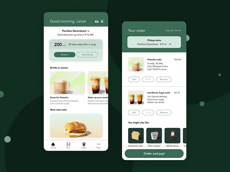
I’ll try to make this fairly short! Focusing on the homepage screen (left), here’s my very short UX sprint redesign on it.
☕️🤔Problem defining
I talked to a couple of my friends and asked them what their intended purpose was everytime they use the app. The most used feature is to:
💫 Checkout new items on the menu (especially seasonal drinks!)
💫 Order for pick up
💫 Scan & redeem points
☕️🤔Analysis of current app
In a nutshell, the homepage is heavily populated with stars, bonuses, and rewards. Heavy text. A line bar.
The images eat up space.
“We don’t really need to see what the coffee looks like. Coffee is coffee.” -Interviewee, 30, drinks starbucks everyday
☕️🤔HMW switch up the app to gear more towards what the users actually use on the app?
☕️🤔 What I did:
- Shoved the text onto “view details” and made the CTA focus on redeem. Got rid of the line bar graph.
Added “pick up location” to gear towards ordering for pick up.
Balanced images and text to ease scrolling and data usage.
Rearranged the navbar to fit the user’s needs the most.
☕️🤔 Final words
- This was a very short project (1-3 hours) in the making. So it might not be the best-and feedback is welcomed!!!
- Possible use of different icons…
- I might go and test this prototype on the target audience, will come back with results!
