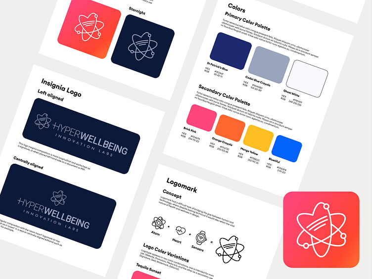
Hyper Wellbeing Brand Guidelines
👋👋👋 Hi frens,
This is one of my earlier works, which went through a colorization-transformation from duller, more tech colors, to brighter more 'people' colors.
The logo or better say logomark for the Hyper Wellbeing as a concept derives from combining elements of chemistry and biology hence the "atom", the "heart" as both a human-related component and as a soulful creation, placing people's wellness at heart (pun intended). The technological aspect that connects the chemistry and life are the sensors, an emerging technology of wearables, that invasively or not help us make use of information (or intimate body data) in way of applying them to action. Measurement -- Information -- Action!
Later the company had been renamed to be more B2B based hence the alteration of the name to more corporate hence 'Hyper Wellbeing Innovation Labs' as you can see in the Insignia Logo section.
From the start 'Hyper Wellbeing' brand has been leader in 'Quantified Health, Wellness & Aging' industries, starting off as an event (I'll be posting more graphic design work from the inaugural 2016 summit in Silicon Valley, and its reincarnation OR how it would look in 2022.
#clients #hyperwellbeing #event #logo #graphicdesign #designers #newdesigners
