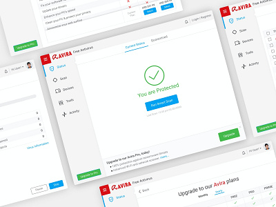
Case Study - Avira Antivirus (Free) redesign
Hi! 👋
I redesign the app to take full ownership of the various roles involved in designing a product. Also to enhancing my learning experience by challenging some design decisions and addressing their solutions.
Why this redesign? Problem / Challenges
In these years, even if Avira have updated the UI, there are many usability challenges:
-
Free users don’t understand the potential of paid protection layers of the Avira Antivirus
-
Outdated parts (Scans, configuration) which are not upgraded to the new design concept yet
-
User feedback is not reliable and takes a lot of time
UI Inconsistency due to lack of Style Guide and or Design system
After this exploration, I set out to reimagine the Avira app and improve the experience in any way I could.
Full case study link: https://sanjayshrestha.com/avira.html
So, do you think this is cool? Hope you enjoy! 😉
Feel free to feedback and comment. Don't forget press "L" if love it. Thanks!
