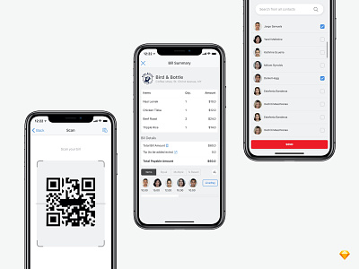
Bill Split App UX Flow
Hello Dribbblers,
Presenting a user experience flow for Livepay, a payment solution app to distribute your restaurant bills equally or mutually within a group of people while payment. I tried to make it clean by using white space and easy to use flow.
Please share your feedback about the color choice and placement of the elements.
If you like what you see, don't forget the press the ❤️ icon and follow me Dribbble and other social platforms to get exciting content and tips.
Thanks for watching! Check out our profile and follow me :)
You can find me here: opulentvikings.com | Behance | Facebook Would you like to hire me? Tell me more at govinddhiman07@gmail.com
More by Govind Dhiman View profile
Like

