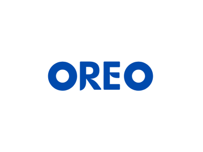
Oreo Redesign
The current logo is... ok, but it could be better. Making it 2d would be better, and more is less, so just one color. I did exactly that. With a better font too. The O's are circles because they're Oreos. And overall looks good.
Full version on Behance: https://www.behance.net/gallery/121052137/Oreo-%28Concept-Image%29
More by Collin Cruz View profile
Like
