Nike Webpage Design Concept

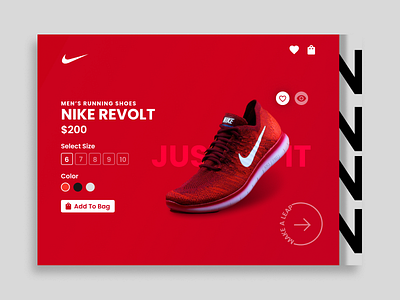
Nike as a company have always been an inspiration for me in terms of creativity and design. Their ideas are fresh and bold and that is reflected in their products and their website UI. The Nike website is very efficient in what it needs to deliver, it utilizes a lot of whitespace to make it breathable and using just white, black and grey primarily it makes it simple and elegant. Colors are mainly used as backdrops to their products to draw the users attention to them which breaks the monotony of black and white.
With this design concept I have tried to bring the same elegant feel and implemented some interesting user interactions which improve the overall experience. Check out this prototype in action on my Instagram
Feel free to connect with me