Button style
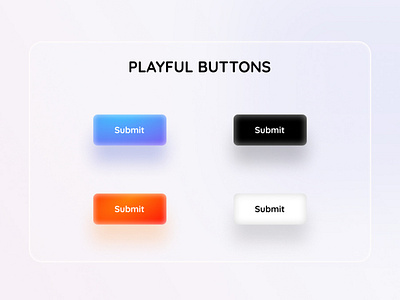
Usually we design CTAs by following styles of Google, Amazon etc. However, there is a big niche ( like kids gaming, kids coding etc. ) that requires playful vibe in their sites. Same button style that Amazon uses may not be a good fit for this niche. Instead using youthful, playful buttons may help this sector to increase conversion. Here is my exploration of a playful button style.
Do you like the style?
For any suggestion reach me out at zakera.wadud@gmail.com
More by Zakera Wadud View profile
Like
