Q Rebrand
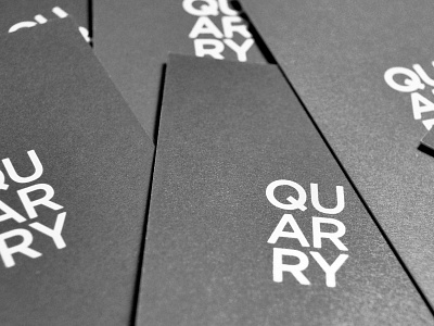
As a marketing firm that specializes and is a leader in the B2B technology sector, a decision was made to refresh the brand while still staying true to the core values they stand for. The stacked letters which represent the building blocks of the organization align well into their rich fourty-year ‘Mad Men’ history. The letters are playful and support a unique and confident vertical read.
