AERO
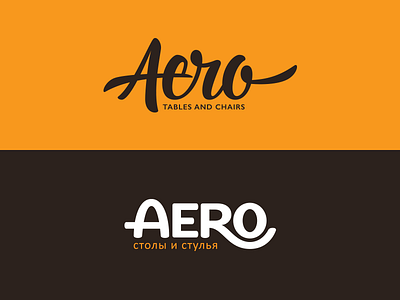
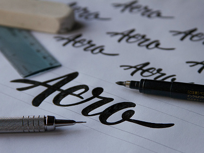
Working on a few options for a furniture company based out of Moscow. The top script logotype was an early concept that is no longer in the running for consideration, but I thought I would share anyway.
We are leaning towards the bottom, more structured variation. I think it makes sense to portray this identity with one that correlates with a geometric foundation. The crossbar of the 'A' shows stability while the leg of the 'R' hugging the 'O' evokes comfort. The letterforms have rounded terminals to give an inviting and friendly aesthetic. This juxtaposition between geometric and organic elements within the characters allow for a compelling image that directly relates to the business model; comfortable and durable furniture.