Charity Homepage Mockup
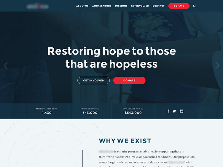
Working on this layout and need some feedback on the main slider image, too dark? Should the image have less color treatment or would this take away from the content on top of the image too much?
Also should I center the content vertically by the top of the 'stats bar' or bottom since it's transparent and the slides will slide behind it?
Thanks for your input!
