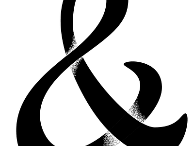
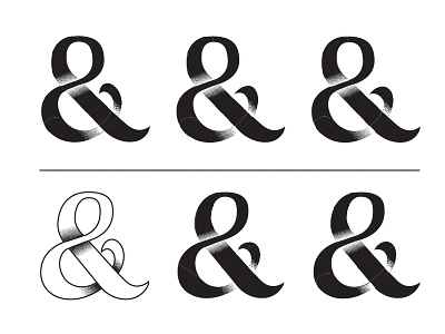
Broken Infinity - Take 2
This is the next round of the process. Liking this style a lot more, feels more whimsical and natural as opposed to the first version that felt too much like a standard font.
Check out the attachment to see the full size.
More by Anthony Fonte View profile
Like

