Happy Til It Hurts
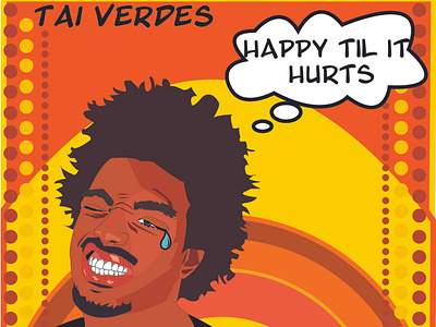
I designed an album cover for a single by Tai Verdes using elements and principles of design such as repetition, balance, line, dot, shape, etc. This was for a school project as part of my diploma of Graphic design from Niagara College (which I am currently studying). I did a dimensional flat illustration of Tai Verdes against a retro background with 70s style typography. The tear drop is an intended pun on the single's title, "Happy Til It Hurts." I created this design in Adobe Illustrator using bold shapes and strokes.