Spring Lake Ranch Logo
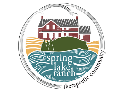
Working with the Communications team of Spring Lake Ranch Therapeutic Community, we collaborated on redesigning the existing logo. It was important to utilize elements from the original design while also evolving them to something that was more identifiable and indicative of SLR's mission in treating mental health and abuse issues using Work Therapy.
Setting up a colorway in this image was important, so those colors could be resued when discussing different aspects of the Ranch's work in print publications and social media.
Teal Blue - REJUVENATION - Residents at Spring Lake Ranch find a new rhythm and flow. Within that rhythm is time to relax, time to work, and time to heal.
Maroon - COMMUNITY - Our community of individuals works together towards a unified goal and with it, a sense of interdependence.
Hunter Green - SOLACE - Set in the wild forests and hills of Cuttingsville, SLR provides its residents with physical distance from their life outside the Ranch.
Gold - WORK - Residents start every morning knowing the tasks and work to be done each day. They can lose themselves - in a safe and guided way - in that work, which provides structure, accomplishable goals, and a sense of teamwork.