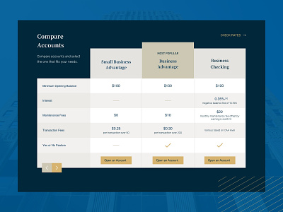
CF Bank :: Compare Accounts Table
This comparison table featured on our financial services client’s website was created to quickly communicate the distinctions between the products they offer so that their users will be motivated to open an account.
In order to keep with the minimal, upscale aesthetic we’d cultivated elsewhere on their website, we used fairly subtle differences in lightness and value to provide distinction between the rows and columns rather than using a more expanded color palette. This application of color as well as a restrained approach to the typography keep the focus on the content itself within the table.
—
Does your website need a facelift? We would love to hear about your needs. Email us at hello@llt-group.com
More by LLT Group View profile
Like
