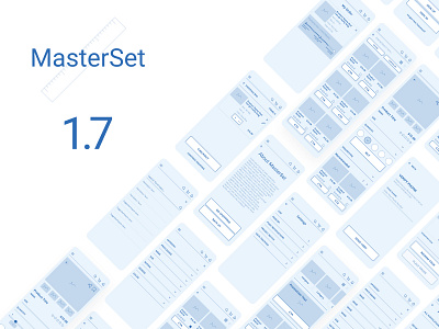
MasterSet 1.7 promo
Hello lovely people <3
I'm playing around with different ideas for the screens that will showcase the wireframe set. I'm still going from background color blue, that gives a heavier tone and maybe is counter productive... Or this one with just white, that make the product centered as the design piece by itself, but my concern is that it will get lost in the see of other images... Still scratching my head with this, but I'm leaning to the other, white solution as it look in the end much cleaner...
Spread the love <3
P.S. Soon there will be a freebee attached to the post
More by Ivica Marinac View profile
Like


