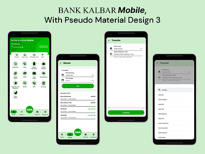
Bank KALBAR Mobile, with pseudo Material Design 3
My take on redesigning BANK KALBAR Mobile app, UI heavily inspired by BRI's BRIMO and OVO. I took assets from Google's official material design kit on Figma, and tried to match inspired UI with material design 3. I wrote a case study about this redesign here, at medium.
More by Dhimas Ilya'sa Swandy View profile
Like
