The Perks of Being a Wallflower
I took one of my favorite novels and decided to re-interpret how the book was read with the use of type and image. The typography is quiet, indicative of the main character's voice. These images were taken in my house and around my hometown, bringing a more personal touch into the book while also creating a richer visual experience for the reader.
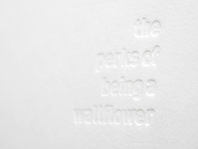
I had a plate made, then debossed the hardcover.
View the full book here: http://bit.ly/migU66
More images and explanation here: http://thejomeister.tumblr.com/post/5578067917/infinite
