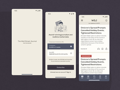
Wall Street Journal App Redesign
I wanted to start my New Year redesigning some screens which I've never designed before. I chose the WSJ App to redesign because I always find it challenging to design news apps, so I thought, why not give this a try.
Besides that, I also wanted to keep the seriousness and trust of the app; that's why I chose this colour palette which is not so colourful, and for the typography, I used the Nexa font.
I would love to hear your thoughts, comments and feedback on this redesign 🙂
👋 Find me on Instagram | Behance | LinkedIn | Figma Community
More by Salman Khan View profile
Like


