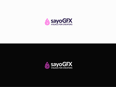
sayoGFX - 2022 Rebrand
About the design:
For my new relaunch I wanted to simplify my logo, since I've realised that my old one had a couple of limitations. I also changed my fonts from Bebas Neue to Apparat, since it offers more diversity and isn't limited to uppercase letters only. The claim "Visuals For Creators" was also added to further define the niche I'm working in, which is content creators like Twitch streamers or YouTubers.
Color Scheme:
My old design featured light and darker blues, however I felt like they don't stand out. The colors were nice, but rather subtle. So, I've changed my color scheme to a bright magenta and a dark purple.
2. 2. 22:
On Feburary 2nd, 2022 I will officially launch my new website sayoGFX.eu where I will post my work and represent my own business in the professional manner it deserves.
