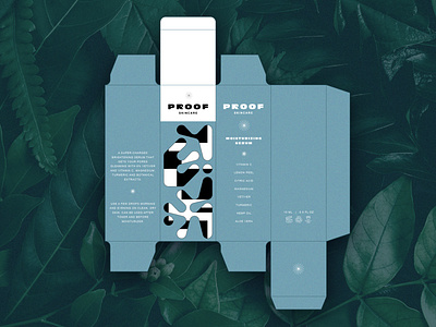
Packaging: Proof Skincare
One-offs from the packaging and identity design project: Proof Skincare
🌿 Proof Skincare – Products that provide natural, multi-layered benefits. Good, inside and out: cruelty-free, naturally derived, and showcased in artful packaging that you can either keep and reuse or recycle.
🌀 Branding Concept – True to the core of Proof, the pattern branding represents the multi-layered benefits of the products and conscious attention to detail from production to output. Key words: fun, retro, calming, and artful.
💎 Design journey – This is case study concept I worked on several weeks transitioning illustration to pattern-build, to identity design, to logo typography, to branding, to packaging, and so on. Really enjoyed pushing starting sketches with a self-generated grid system to create the unique pattern core to the identity design. Also, getting into a new variety of mockups with packaging.
👉 Visit @cazacreative for the full process video.

