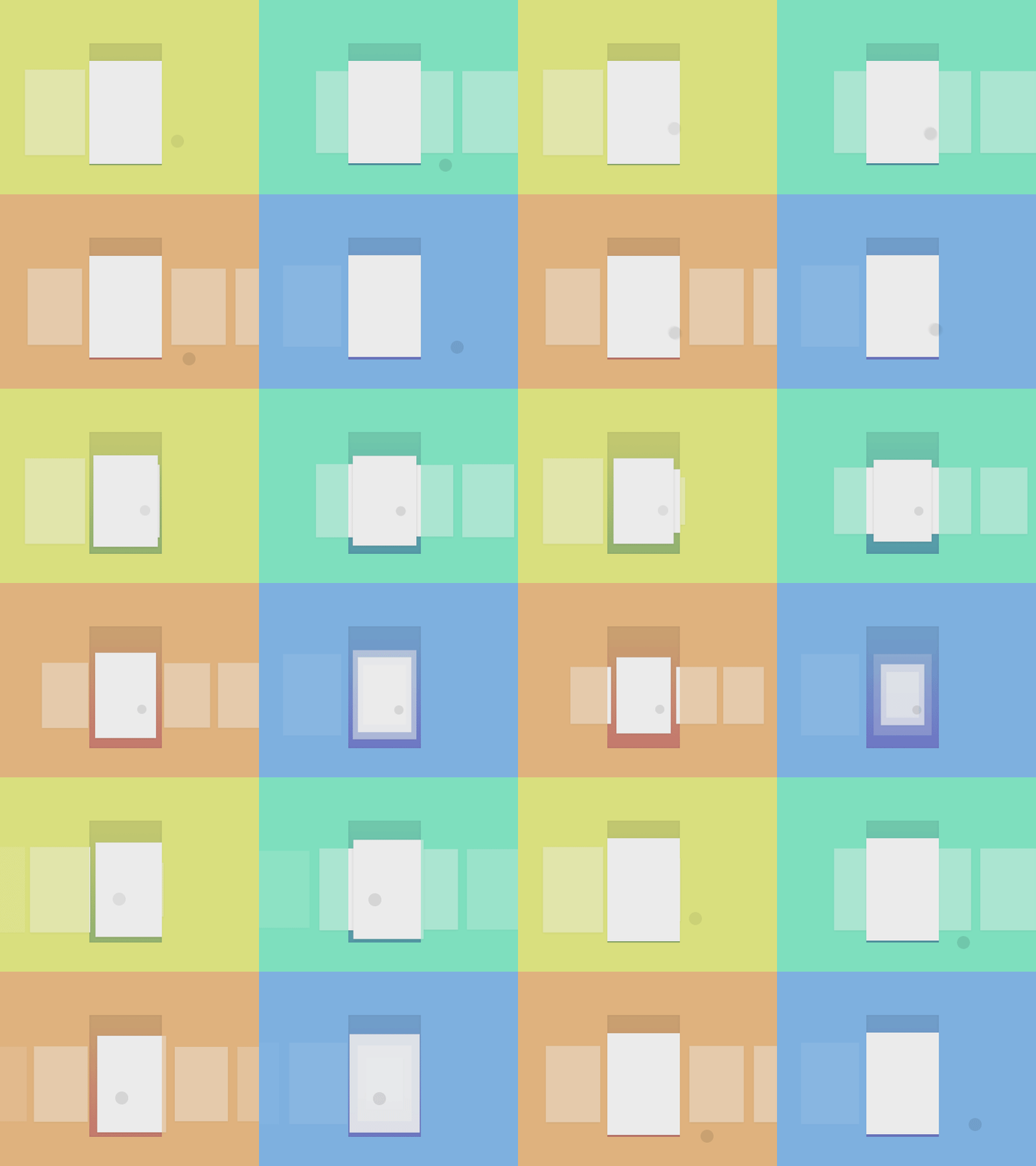
Cards Swipe Animation
Exploring a few ways to represent the swipe animation for my next project. these are only 4 of the iterations. I've divided the animation in two states: tap/hold - swipe. Tried to make them simple and intuitive. I also didn't want the cards to be always in a smaller scale to show that thay're swipable. When the user opens the app, the cards will appear with the same animation, so he'll be coached about the swipe interaction.
Which one do you prefer? Feedbacks are extremely appreciated.
More by Ehsan Rahimi View profile
Like
