Sprocket Android App Icon Gradient Experiments
7
for
Retrographic
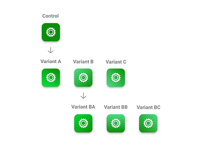
Running a new Play Store experiment with icon gradients. Variant B seems like its going to win the first round and my hypothesis is that its lighter = happier and also that it feels better to people than a flat or concave feel. So in the second follow-up experiment I will test the same winning gradient angle with CashApp's color as well as two other angles with the acid green. Which one do you think will win? Comment below 👇
If you like it, don't hesitate to click "L" 💗 or "F"
Sprocket Bicycle App on Android - Sprocket Bicycle App on iOS - Sprocket Bicycle Blog on Instagram - Sprocket Bicycle Blog on Tumblr - Sprocket Bicycle Blog on FB