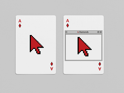
WIP History of UI Playing Cards
I'm toying with the idea of creating a deck of cards based on the "History of UI" and aligning each suit within the deck to an influential period in UI design.
I JUST kicked this off so these are pretty early on exploration.
I kinda like the idea of the second card, using the old Mac OS style window to contain the center of the card - at least for the Ace, King, Queen, and Jack. Idk - I'm still playing with it.
I want to share this and share the progress as things go to get ideas and feedback. (please keep it constructive)
What period of UI design had the biggest impact on you as a creative? What elements of UI do you just LOVE?
I am a collector of cards, I have a dozen plus decks and continue to collect them. I follow a creative by the name of Ten Hundred and he put out a pack of cards earlier this year (2021) called Vivid Kingdoms that I backed. But what I love about how he did it is he got community input and ideas. That's one of the best parts about being a creative, working with others and collaboration.
With that said, I'm going to try to get through a whole deck in my spare time, it may take a while. The above comps I already see things I will change and I missed (yes some solid mistakes, again it's in free time so it might be rushed at times).
So expect some more of these in the future, it should be fun. Idk if they will turn out to be something worth actually printing, or a complete throw away project. Either way, this Ace of Diamonds has already got me that little push to keep things moving forward.
Thanks!
PS - Check out Ten Hundred, he's amazingly talented: https://www.tenhundredart.com
