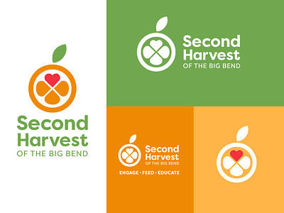
Second Harvest of the Big Bend Logo Design
This is a logo redesign I did a couple of years ago. Because they are located in Florida, the logo takes its signature shape from one of Florida’s most iconic fruits, the orange. Three orange segments reflect Second Harvest of the Big Bend’s mission statement to feed, educate, and engage the community to help end hunger in the Big Bed region. The heart represents the passion that drives the community members who dedicate their time and effort to Second Harvest. Colors are in sync with the Feeding Florida branding umbrella.
More by Whitney McTiernan View profile
Like
