Operation Resource Arizona (ORA) Logo
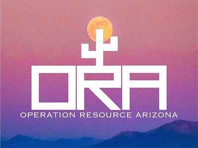
The founder of ORA wanted a logo that delivered a labyrinth type of feel, along with a cactus (popular in Arizona) to signal growth. Additionally, the company wanted to develop a brand identity that captured the atmosphere their local arena. This is why the background image captures the Arizona sunset. There is an alternate version of this logo where the colors are in reverse, and the background is white, with the letters and cactus featuring a sunset style gradient using colors from the image above.
