Automatic Web Dashboard

We’re excited to announce the Automatic Web Dashboard, an all new place for you to explore the data behind the drives you take with Automatic. The Dashboard lets you dig deeper and spot trends so you can learn more about your driving habits. Check out the demo.
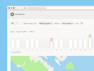
On the Dashboard, you can access all your trips and see them in a list, map, and graph simultaneously. Filter and visualize your trips in ways that are interesting to you, say, by how much the fuel costs, how long they are, or by which cars you drive. For example, you can easily view just the trips where you drive during your commute hours during the summer and learn how much time and money you’re spending on your way to work. Use it to find the cheapest route or a time to leave home that gives you the shortest commute time.
The goal was to design this in way that provided people with access to much more data but looked familiar and stayed true to the design language we've been developing in our app.
Whether you are an Automatic user or not, you can log in to your own account or try a demo at dashboard.automatic.com