Dashboard and percentage area chart
Wooha! Haven't posted anything here in a good while. The good news is that I have been super busy working with clients. Unfortunately many of the projects are of the type that I haven't been able to share the results as much as I would have liked.
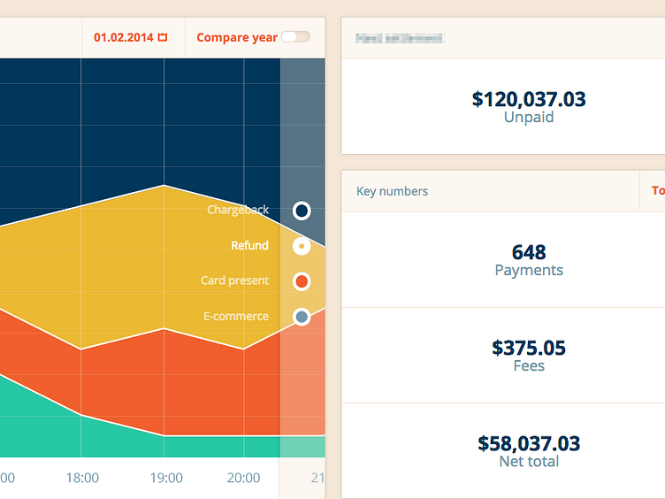
Here is a little example of a dashboard design I'm working on. I'm really happy with the design of the chart legend. The labels are only displayed when the mouse hovers over the legend bar/area and the coloured circles also double as check boxes to hide and show the data in the chart.
The picture is a screenshot of a pretty high-fidelity prototype I will be working on for the next few months.