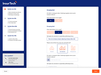
Onboarding questionnaire 2/2
Example 2 of 2: The intention of this project was to maximise the UX of online questionnaires. Progress indication, grouping and whitespace are used meaningfully. The repetition of data entry boxes is broken up with clickable illustrative elements with transition effects
More by Monkeypolice.com View profile
Like
