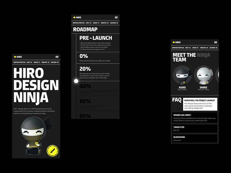
Hiro NFT Mobile Website
Here is the mobile version for the Hiro NFT website!
Every search must be easy and flowing.
Here's what the hub of little Broworks Ninjas would look like in a different screen size version. Again, we like it bold, both font and 3D images. We also relied a lot on color and light in our design.
Although Hiro and headings are oversized, the design is well balanced with negative space and few details. That makes the search easy and the overall experience pleasant.
Welcome to read more about color design trends for winter 2022, and to learn more about 7 basic types of buttons in UI design.
We're available for fresh projects.
Stalk us:
More by Broworks View profile
Services by Broworks
Like

