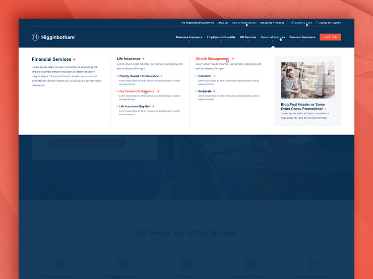
Higginbotham - Mega Menu
Higginbotham was an amazing client to work with, and they were in the midst of a complete identity rebrand when they came to us. We worked closely with their 3rd party branding company to ensure that our messaging had the appropriate tone/voice, and to ensure that our page designs matched the new sophisticated branding aesthetics. When we presented our Key Page Designs, we shared them simultaneously with the client and the 3rd party branding company... a potentially challenging situation because each of these audiences could have slightly different objectives and sensibilities. At the end of the presentation, however, we were met with very positive approvals from both parties.
This project required a mega menu that allowed the admin to tease a few levels of website architecture. In this shot, you can see a clean user-friendly layout, and a few hover states... the hover states are always a great touch that help the client understand what the finished product will look like, PLUS, these hover states really help when the project moves into development, providing specific direction for what exactly the developer needs to build.
